The Ultimate Guide to Tailwind CSS and its Best Practices

Introduction to Tailwind CSS
I’ve been using Tailwind CSS since 2018 in a plethora of projects. Since then, I’ve only written a few lines of traditional CSS. Once I got the hang of Tailwind CSS, I couldn’t go back. Naturally, I have a lot to say about it, and I hope you’ll find this guide helpful and soon realize how powerful this framework is.
By the way, if this guide isn’t enough, I recommend “Level up with Tailwind CSS” by Shruti Balasa, who is far more skilled at Tailwind CSS and CSS in general than I am. You won’t regret it.
What is Tailwind CSS?
Tailwind CSS is a framework designed around the utility-first philosophy.
Instead of writing classic CSS, it encourages you to combine multiple classes to create the desired appearance.
Tailwind CSS was created back in 2017 by Adam Wathan and Steve Schoger.
Here’s how we used to style buttons since the beginnings:
.btn {
    background-color: blue;
    color: white;
    padding: 1rem;
}
Here’s how Tailwind CSS helps you do it:
<button class="bg-blue-400 p-4 text-white">
    Click me
</button>
Is Tailwind CSS Free?
Yes, Tailwind CSS is 100% free.
You can even contribute to it yourself on the official repository, as it’s open source.
You might have heard about commercial products built around the framework. But these are completely optional; you will never need them to use Tailwind CSS effectively.
Why Tailwind CSS is a Blessing
Tailwind CSS comes with the following benefits:
- You’ll say goodbye to unused styles
- You’ll never end up with 4,394 different
color,margin, orz-indexvalues - You won’t have to bother with best practices that nobody on your team wants to follow
With that, speed of execution will increase, and you’ll enjoy crafting user interfaces again.

Tailwind CSS vs Bootstrap 5: Utility Classes vs. Components
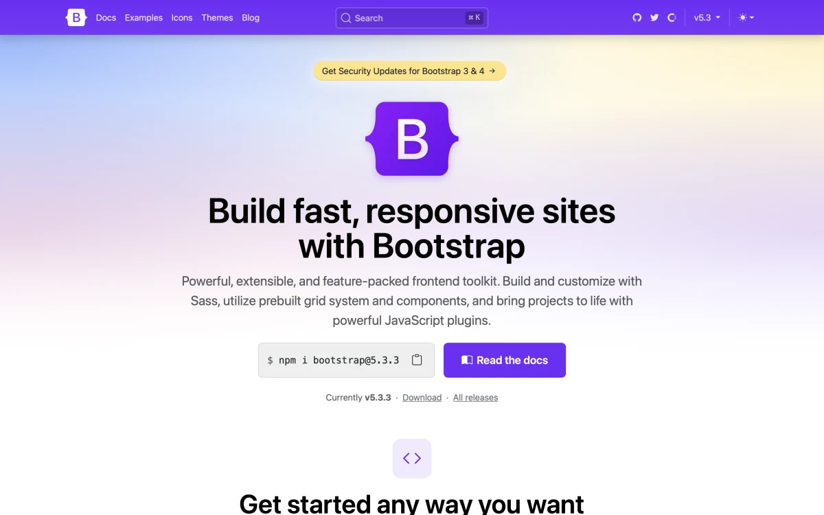
In short, Tailwind CSS is a utility-first CSS framework, and Bootstrap 5 is mainly a collection of UI components.
For instance, with Tailwind CSS, building a call-to-action button can be done this way:
<button class="bg-blue-600 px-4 py-3 text-white rounded">
    Get Started
</button>
The equivalent in Bootstrap would be:
<button class="btn btn-primary">
    Get Started
</button>
Comparing Tailwind CSS to Bootstrap is like comparing apples to cars; it doesn’t make sense.
Bootstrap is more than a bunch of utility CSS classes. It provides many excellent UI components that make use of JavaScript. Therefore, it has a larger footprint.
When used correctly, Tailwind CSS is extremely small (especially after compression).
Both are highly customizable.
Tailwind CSS will better fit teams that strongly value unique user interfaces.
Big Names using Tailwind CSS
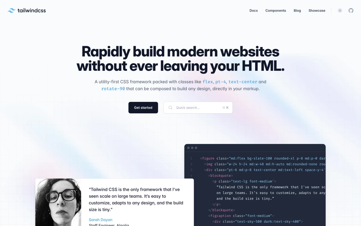
The list of big companies using Tailwind CSS is quite impressive.
Some of them fully use the framework, while others do a weird blend.
And if you take a look at their code, you can see how they customize Tailwind CSS to their needs.
Here are a few of them:
- GitHub, for their research website
- Google, for their I/O 2022 conference website
- Laravel, for the Laracon Online website
- Loom
- Mashable
- Microsoft .NET
- NASA, for their Jet Propulsion Laboratory website
- Netflix, for their global top 10 microsite
- SavvyCal
- Shopify
- The Verge
See more on the official website of Tailwind CSS.
Tailwind Play: Your Browser-Based Playground
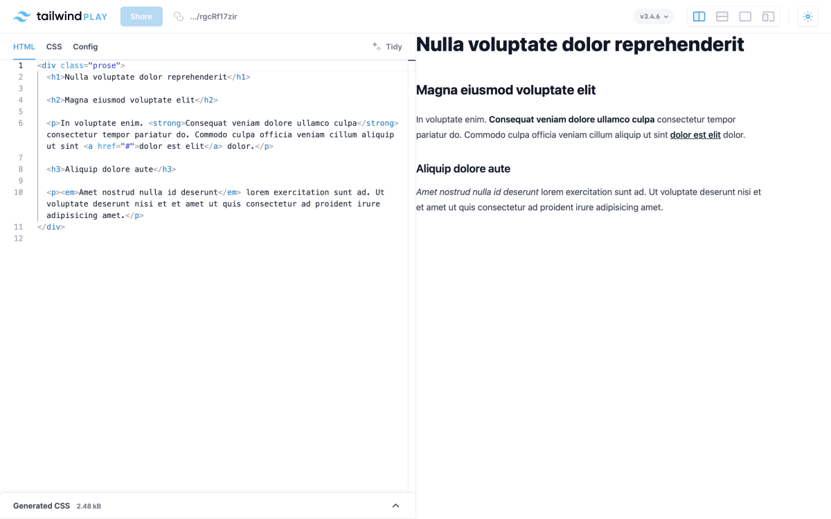
Tailwind Play is the best tool to focus on quickly crafting a piece of UI right from your browser.
It’s a straightforward web application with the following features:
- An HTML editor with great autocompletion (including every class from the framework)
- A CSS editor
- A config editor
- A magic button to reformat your code
- A version switcher to use an experimental or older version of the framework
- A layout switcher
- A light and dark mode switcher
That’s it, and that’s all you need to get started with Tailwind CSS.
You can jump to the last part of this tutorial, where we’ll craft a UI element to get the hang of the framework.

Tailwind Play CDN for Rapid Development
Tailwind Play CDN is not the typical CDN that serves a static file. It parses your HTML and injects the corresponding CSS into a <style> tag.
This is a great way to prototype any idea you have quickly.
- Create an index.html file.
- Paste this code:
<!DOCTYPE html>
<html>
<head>
    <meta charset="UTF-8" />
    <meta name="viewport" content="width=device-width, initial-scale=1, viewport-fit=cover" />

    <script src="https://cdn.tailwindcss.com"></script>
</head>
<body>
    <h1 class="text-3xl font-bold underline">
        Hello, world!
    </h1>
</body>
</html>
Et voilà!
I recommend using something other than it in production, as your performance may suffer.
Advanced third-party tools
Tailscan: Real-time Building and Debugging
With hot reloading, using Vite or Webpack for instance, we can see our changes live in the browser every time we save our code.
But what if we could go a step further? Like building and debugging right in the browser? That’s exactly what Tailscan lets you do!
Even though I can easily render CSS in my head (after 18 years of experience, that’s second nature, haha!), the creativity unlocked by the speed of execution Tailscan offers is priceless.
You can try the tool on the website and install their Chrome extension. Here’s a demo:
Windframe: Visually Build UIs with AI
Windframe solves a common web development problem: the time-consuming process of building attractive and responsive websites.
This AI-powered Tailwind CSS builder lets users create web interfaces visually, without extensive coding. It offers drag-and-drop functionality, pre-built templates, and AI assistance for responsive design and dark mode creation.
You can even export your designs to HTML, React, or Vue, making Windframe versatile for any projects.
It’s definitely worth giving it a try!
Set Up Tailwind CSS
Ultimately, Tailwind CSS is just a collection of styles. It can be integrated into any project.
For instance, the official website shows how to use Tailwind CSS with its CLI tool.
Or using PostCSS: https://tailwindcss.com/docs/installation/using-postcss
And even apps that use Vite for processing and serving assets: https://tailwindcss.com/docs/guides/vite
You may also be interested in how to integrate Tailwind CSS inside a Laravel project that uses Vite (like this very blog): Add Tailwind CSS to any Laravel project
Or if you’re still using Mix: https://tailwindcss.com/docs/guides/laravel#mix
Learning Tailwind CSS Through Video
Videos are a great way to learn a new technology. There are plenty of free courses across the web, just one Google search away from you.
That said, there are some I would recommend to anyone who’s not familiar with the framework.
First, Laracasts offers a free course called HTML and CSS workshop using Tailwind CSS.
Tailwind CSS even has an official YouTube channel.
They provide great videos showing off how to build useful UI components like “Building a command palette with Tailwind CSS, React, and Headless UI” or what could be your assignment at your job: “Translating a Custom Design System to Tailwind CSS”.
Getting Help by Leveraging the Official Forum
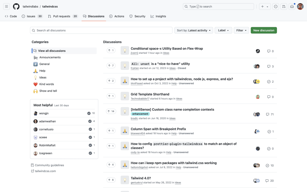
Tailwind CSS has an official forum powered by GitHub Discussions. Feel free to ask about anything you’re unable to find in Google, the official documentation, or ChatGPT.
Tailwind CSS Best Practices
Customization via Configuration File
Tailwind CSS lets you customize many things by simply editing the tailwind.config.js file.
For example, if you want to add a new color, you can extend the default theme to add your own set of values:
/** @type {import('tailwindcss').Config} */
module.exports = {
    theme: {
        extend: {
            colors: {
                brand: '#abc123',
            },
            fontFamily: {
                handwriting: ['Some handwriting font'],
            }
        }
    }
}
By leveraging the configuration file properly, tons of classes and their variants will be automatically generated for you like bg-brand, text-brand, border-brand, hover:bg-brand, etc.
Learn more on the official documentation.
Visual Studio Code Plugins
Tailwind CSS IntelliSense
Tailwind CSS IntelliSense is an official plugin made by Tailwind Labs that helps every developer work more efficiently with the framework by adding features like autocomplete, syntax highlighting, and linting.
A must-have!
Tailwind CSS IntelliSense on the Visual Studio Code marketplace.
Inline Fold
If you feel overwhelmed by the number of classes in your HTML, you might want to collapse the class attribute for improved clarity.
Inline Fold is a plugin for Visual Studio Code that solves this problem really well.
Inline Fold on the Visual Studio Code marketplace.
Improving Readability
Let’s say you have a button that looks like this:
<button class="bg-gradient-to-r from-indigo-300 dark:from-indigo-500 to-indigo-400 dark:to-indigo-600 font-semibold px-4 sm:px-6 py-2 rounded shadow-lg text-sm text-white w-full">
    Click me
</button>
One easy trick to make it more readable is to break the class attribute into multiple lines:
<button
    class="bg-gradient-to-r from-indigo-300 dark:from-indigo-500
    to-indigo-400 dark:to-indigo-600 font-semibold px-4 sm:px-6
    py-2 rounded shadow-lg text-sm text-white w-full"
>
    Click me
</button>
Component Extraction
Extracting your button to a component (Blade, React, Vue, or whatever you like) will drastically clean up your files.
Here’s a Blade template file using a button component containing the same code as above:
<!DOCTYPE html>
<html>
    <head>
        …
    </head>
    <body>
        …

        <x-button>
            Book me
        </x-button>

        …
    </body>
</html>
Avoiding Parent Class Extraction
Extracting a bunch of Tailwind CSS classes to a parent class is tempting.
.btn {
    @apply bg-gradient-to-r from-blue-400 to-blue-300 px-4 py-3 rounded
}
However, this completely defeats the purpose of Tailwind CSS, which is to have a single source of truth and make things easier to manage.
Instead, use your editor’s multi-cursor feature and create sub-components thanks to whatever templating engine you use.
Here’s an example written using Laravel’s Blade templating engine:
{{-- Somewhere in your views… --}}
<x-primary-btn>
    Click me
</x-primary-btn>

{{-- primary-btn.blade.php --}}
<x-btn class="bg-gradient-to-r from-blue-400 to-blue-300 text-white">
    {{ $slot }}
</x-btn>

{{-- btn.blade.php --}}
<button {{ $attributes->merge(['class' => 'bg-gray-200 px-4 py-3 rounded']) }}>
    {{ $slot }}
</button>
- We begin with a base
btncomponent with a gray roundedbuttonthat is enough for most cases. - Then, we have a
primary-btncomponent that extends thebtncomponent and adds a blue gradient background and white text. This component can be used for call-to-action buttons.
Official Tailwind CSS Plugins
The Container Queries Plugin
Instead of using media queries and viewport sizes to change an element’s layout, we can rely on the size of its container.
Here’s all about container queries on CSS-Tricks: Say Hello to CSS Container Queries
The container queries plugin provides a convenient way to handle them in a Tailwind CSS fashion.
<div class="@container">
    <div class="@lg:underline">
        <!-- This text will be underlined when the container is larger than `32rem` -->
    </div>
</div>
Read the official documentation on GitHub.
The Forms Plugin
The forms plugin is maintained by the team from Tailwind CSS. It resets forms to a consistent state across all browsers and makes them easily stylable.
Learn more: Tailwind CSS forms plugin: a step-by-step guide
The Typography Plugin
The typography plugin contains tons of styles, which you can customize, for written content. It’s extremely well done and useful.
<article class="prose lg:prose-xl">
    <!-- Parsed Markdown -->
</article>
Here’s a live demo: https://play.tailwindcss.com/rgcRf17zir
And by the way, you’re actually witnessing those styles on this blog post. 😎
I’ve written in more details about it here: Tailwind CSS typography plugin: a step-by-step build guide
Unofficial plugins
fullwindcss
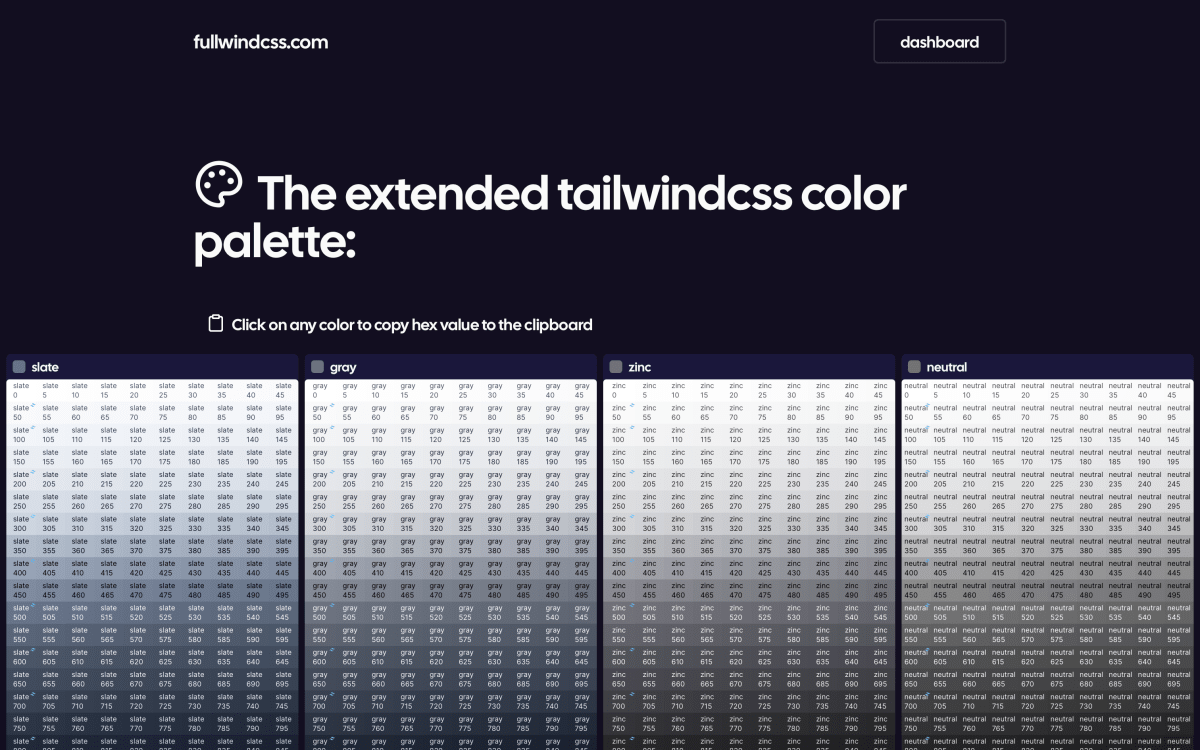
I recently came across a Tailwind CSS plugin called fullwindcss that expands the default color palette. Instead of the standard 11 shades per color, it offers 1001 shades for each. This allows for more nuanced color choices, which can be particularly useful when designing hover states or dark themes.
The plugin uses CIELAB color space for interpolation, aiming to provide visually pleasing gradients. What I found interesting is that it maintains compatibility with the original Tailwind colors, so it can be integrated into existing projects without disrupting the current design. While it’s not necessary for every project, it could be a helpful tool for designers who frequently work with complex color schemes or need very specific shades in their designs.
UI Kits
Due to its utility-first philosophy, Tailwind CSS allows you to copy and paste fully-designed components into any website.
This is one of its strengths and you can experiment with component libraries right now. I’ve compiled a list of free and paid ones.
Free
Paid
Tailwind CSS Alternatives
As with everything in life, there are alternatives.
Keep in mind we are looking for purely utility-first CSS frameworks. UI frameworks like Bootstrap actually have utility classes, and you can use them if you like.
These frameworks below can be integrated into any project based on any JavaScript framework (Ember, React, Svelte, Vue.js, etc.):
