6 minutes read
Tailwind CSS forms plugin: my 2025 guide for v4 and v3
 Written by
Table of contents
Introduction
Tailwind CSS is a utility-first CSS framework for productive frontend developers.
If you have never heard of it, let me introduce you to the marvelous world of pragmatic CSS frameworks.
In this article, I’ll show you its forms plugin. It helps unify form appearance across browsers and makes them easier to customize.
What is @tailwindcss/forms?
@tailwindcss/forms is an official plugin that resets forms to a consistent state across all browsers and makes them easy to style.
What the plugin does and doesn’t style
The tailwind forms plugin targets common controls like text inputs, selects, textareas, checkboxes, and radios so they look consistent. Some uncommon controls, like input[type="range"], are intentionally not styled. This avoids using a broad input selector that could cause unwanted side effects. See the full list in the plugin README.
Installation
Here is how to do a Tailwind v4 plugin install, plus a v3 fallback.
Installation for Tailwind v4
Install as a dev dependency:
npm install -D @tailwindcss/forms
Or with Yarn:
yarn add -D @tailwindcss/forms
Register the plugin in your main stylesheet after importing Tailwind:
/* app.css or main.css */
@import "tailwindcss";
@plugin "@tailwindcss/forms";
Installation for Tailwind v3 (legacy)
Install as a dev dependency:
npm install -D @tailwindcss/forms
Or with Yarn:
yarn add -D @tailwindcss/forms
Then enable it in your Tailwind config:
// tailwind.config.js
module.exports = {
    plugins: [
        require('@tailwindcss/forms'),
    ],
}
Note: install as a dev dependency and rebuild your CSS as part of your normal build step.
Usage in your forms
First, I recommend you try the live demo.
Important: styles apply only to specific input types. A plain <input> with no type will not pick up styles. Make sure to set a type like type="text" or one from the list below.
Once the forms plugin is ready, your forms get clean, accessible defaults.
Here are all the supported form elements:
input[type='text']input[type='password']input[type='email']input[type='number']input[type='url']input[type='date']input[type='datetime-local']input[type='month']input[type='week']input[type='time']input[type='search']input[type='tel']input[type='checkbox']input[type='radio']selectselect[multiple]textarea
As mentioned in the README on the official GitHub repository, you must at least use type="text" (or any of the types mentioned above) for the styles to take effect.
This is a trade-off to avoid relying on a greedy
inputselector and unintentionally styling elements the plugin does not handle yet, likeinput[type="range"].
Now you can style a select element: this is a simple way to style select with Tailwind.
<select class="px-4 py-3 rounded-full shadow">
  ...
</select>
You can also change a checkbox color using text color utilities (tailwind checkbox color):
<input type="checkbox" class="rounded text-green-400" />
Tip: Tailwind’s native accent color utilities work great too. For example, accent-purple-600 on a checkbox or radio. See the accent-color docs.
Use classes instead of global styles for your forms
In some cases, you may want a less opinionated approach for existing projects, so instead of global resets you can use the classes provided by the plugin.
The strategy option controls this: base generates global resets; class is opt-in.
| Base | Class |
|---|---|
[type='text'] |
form-input |
[type='email'] |
form-input |
[type='url'] |
form-input |
[type='password'] |
form-input |
[type='number'] |
form-input |
[type='date'] |
form-input |
[type='datetime-local'] |
form-input |
[type='month'] |
form-input |
[type='search'] |
form-input |
[type='tel'] |
form-input |
[type='time'] |
form-input |
[type='week'] |
form-input |
textarea |
form-textarea |
select |
form-select |
select[multiple] |
form-multiselect |
[type='checkbox'] |
form-checkbox |
[type='radio'] |
form-radio |
To opt into class-based styling in Tailwind CSS v4, configure the plugin like this:
/* app.css */
@plugin "@tailwindcss/forms" {
  strategy: "base"; /* Only generate global styles. */
  strategy: "class"; /* Only generate classes. */
}
And in Tailwind CSS v3:
// tailwind.config.js
module.exports = {
    plugins: [
        require('@tailwindcss/forms')({
            strategy: 'base', // Only generate global styles.
            strategy: 'class', // Only generate classes.
        }),
    ],
}
Build a beautiful newsletter form
This blog’s interface was built with Tailwind CSS, and I also use the forms plugin. Why don’t we create something like a newsletter form just to get our hands dirty?
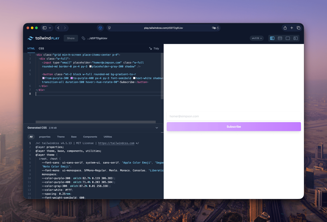
Let’s start with the label and input field (live demo on Tailwind Play):
<input type="email" placeholder="homer@simpson.com" class="w-full rounded-md border-0 px-4 py-3 placeholder-gray-300 shadow" />

<button class="mt-2 block w-full rounded-md bg-gradient-to-r from-purple-300 to-purple-400 px-4 py-3 font-semibold text-white shadow-lg transition-all duration-500 hover:-hue-rotate-90">
	  Subscribe
</button>
w-full: makes the input take the full width.rounded-md: makes the border rounded.border-0: the Tailwind CSS forms plugin adds a border by default, so this removes it.px-4 py-3: padding values that feel right here.placeholder-gray-300: placeholder text is lighter, so it reads as a hint.shadow: adds a small box shadow for depth.focus-visible:ring-2 focus-visible:ring-purple-400 focus-visible:ring-offset-2: gives a clear focus style for accessibility.
Then, the button:
<button
    class="mt-2 w-full rounded-md bg-gradient-to-r from-purple-300 to-purple-400 px-4 py-3 font-semibold text-white shadow-lg focus-visible:outline-none focus-visible:ring-2 focus-visible:ring-purple-400 focus-visible:ring-offset-2"
>
    Subscribe
</button>
mt-2: adds a bit of spacing.bg-gradient-to-r from-purple-300 to-purple-400: a soft purple gradient from left to right.font-semibold: slightly bolder text.text-white: white text.shadow-lg: a larger shadow that helps the button stand out.focus-visible:ring-2 ...: a visible focus ring.
Accessibility note: always pair inputs with labels, do not rely on placeholder alone, and make sure focus states are visible. If you include checkboxes or radios, you can use accent-* classes like accent-purple-600 for a clear, native color. See the accent-color docs.
FAQ
Why aren’t my inputs styled?
Add a specific type like type="text". Check that the plugin is installed for your Tailwind version: v4 uses the @plugin directive in your CSS; v3 uses plugins: [require('@tailwindcss/forms')] in tailwind.config.js. Also note that inputs like type="range" are not styled. See the plugin README.
How do I opt out of global styles?
Use the plugin option strategy: 'class' so styles apply only when you add classes like form-input. This is the tailwind plugin strategy class vs base toggle.
How do I change checkbox or radio color?
You can keep using text-{color} with the plugin, or use modern accent-{color} (for example, accent-green-600) for better native behavior. See the accent-color docs.
Conclusion
The Tailwind CSS forms plugin gives you consistent, easy-to-style controls out of the box. Use base when you want global resets across your app; use class when you want opt-in control with utilities like the form-input class. Try the official live demo and experiment with my Tailwind Play example.
Did you like this article? Then, keep learning:
- Learn to style and control HTML dialog backdrops using Tailwind CSS
- Understand and fix hover style issues on mobile with Tailwind CSS
- Learn how to easily add Tailwind CSS to Laravel projects for great UI
- Learn how to style text from CMS using Tailwind CSS typography plugin
- Deep dive into Tailwind CSS best practices for productive front-end development


0 comments