7 minutes read
Tailwind CSS typography plugin: a step-by-step build guide
 Written by
Table of contents
Introduction to making your proses beautiful
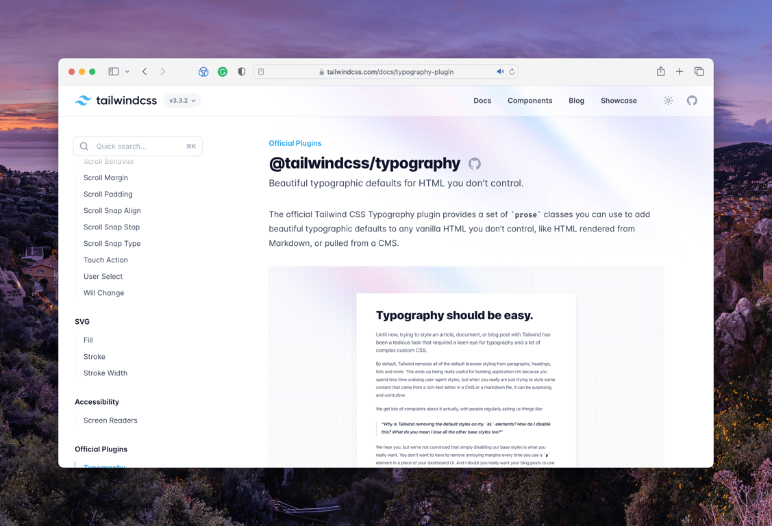
To me, one of the key features of Tailwind CSS is its typography plugin, which offers opinionated defaults, and also easy customization to our proses.
The blog post you are reading is actually using this plugin!
Now, let’s walk you through a step-by-step guide on installing and using it to build your own beautiful blog posts (which is, of course, just one use case among many others).
What is @tailwindcss/typography?
@tailwindcss/typography is a plugin that helps make your text look great.
It comes with ready-to-use styles for your HTML. You don’t need to write your own CSS. This is very helpful when working with HTML generated from Markdown content for instance (like in this blog post).
Let’s start by adding the plugin to your project and learn how to use it.
Installation
Before you start using the plugin, you need to install it. Follow these simple steps:
Open your terminal and type this command:
npm install -D @tailwindcss/typography
This will install the plugin from the NPM repository.
Now, add the plugin to your tailwind.config.js file. Open the file and add this code:
module.exports = {
    plugins: [
        require('@tailwindcss/typography')
    ]
}
This tells Tailwind to actually use the typography plugin.
That’s it! The plugin is installed. Now, let’s learn how to use it in your project.
Usage
You can now use the prose classes to style your text.
Here’s an example of how to use these classes with simple HTML:
<article class="prose">
    <h1>Lorem ipsum dolor sit amet</h1>
    <p>Minim non consequat ullamco esse excepteur et voluptate magna eu proident esse consequat. Esse velit et sit quis ipsum amet eu elit.</p>
</article>
In this example, we wrap the HTML content in an <article> element and add the prose class. This class applies nice styles to the text inside.
Honestly I don’t do a lot more than that on this blog. This is already a huge time saver.
Choosing a grayscale (the theme)
The Tailwind CSS typography plugin comes with built-in themes to make your content look even better.
You can easily style your content to match the colors you’re using in your project. Here’s how to do it:
Wrap your content in an <article> element with the prose class.
Then, add a theme modifier class.
<article class="prose prose-slate">
    …
</article>
Here are the available theme classes with their corresponding color scales:
prose-gray(default) - Grayprose-slate- Slateprose-zinc- Zincprose-neutral- Neutralprose-stone- Stone
Remember to always include the prose class when adding a theme modifier.
Applying a type scale (the font size)
Tailwind CSS typography plugin makes it easy to adjust the overall size of your text for different situations.
It includes five different typography sizes out of the box that you can use to change the font size of your content:
prose-sm- 0.875rem (14px)prose-base(default) - 1rem (16px)prose-lg- 1.125rem (18px)prose-xl- 1.25rem (20px)prose-2xl- 1.5rem (24px)
To apply a type scale to your content, add the corresponding size modifier class to the <article> element:
<article class="prose prose-xl">
    …
</article>
These size modifiers can also be combined with Tailwind CSS’ breakpoint modifiers to change the font size of your content at different viewport sizes:
<article class="prose md:prose-lg lg:prose-xl">
    …
</article>
With these type scale options, you can easily adjust the size of your text to fit different scenarios and make your content more readable across various screen sizes.
Support dark mode
To make your blog post look great in dark mode, the Tailwind CSS typography plugin includes a hand-designed dark mode version for each default theme.
To enable it, simply add the dark:prose-invert class to the <article> element:
<article class="prose dark:prose-invert">
    …
</article>
Now, when your website is in dark mode, the text will automatically adjust to look great with the dark background.
In the next sections, we’ll learn how to customize elements within your blog post and how to create your own theme for a unique look.
Customizing individual elements
Now that we understand how the Tailwind CSS typography plugin works, let’s dive deeper into customizing individual elements within our content.
The plugin provides a wide range of element modifiers that directly tailor specific elements such as headings, links, images, and more in your HTML.
Styling headings, links, and images
Let’s say you want to customize the headings to be underlined, links to have a specific brand color, and images to have a rounded border.
Here’s how you would do it:
<article class="prose prose-headings:underline prose-a:text-blue-600 prose-img:rounded-xl">
    …
</article>
With this configuration, your h1, h2, h3, and h4 headings will have an underline, your links will be styled with a blue color (with a hex value of #4A64FF), and your images will have a rounded border.
A complete list of prose element modifiers
Here is a comprehensive list of available element modifiers that you can use to customize your content:
prose-headings:{utility}: Targetsh1,h2,h3,h4, andthprose-lead:{utility}: Targets[class~="lead"]prose-h1:{utility}: Targetsh1prose-h2:{utility}: Targetsh2prose-h3:{utility}: Targetsh3prose-h4:{utility}: Targetsh4prose-p:{utility}: Targetspprose-a:{utility}: Targetsaprose-blockquote:{utility}: Targetsblockquoteprose-figure:{utility}: Targetsfigureprose-figcaption:{utility}: Targetsfigcaptionprose-strong:{utility}: Targetsstrongprose-em:{utility}: Targetsemprose-code:{utility}: Targetscodeprose-pre:{utility}: Targetspreprose-ol:{utility}: Targetsolprose-ul:{utility}: Targetsulprose-li:{utility}: Targetsliprose-table:{utility}: Targetstableprose-thead:{utility}: Targetstheadprose-tr:{utility}: Targetstrprose-th:{utility}: Targetsthprose-td:{utility}: Targetstdprose-img:{utility}: Targetsimgprose-video:{utility}: Targetsvideoprose-hr:{utility}: Targetshr
When using these modifiers alongside others like hover, it’s best to have the other modifier come first:
<article class="prose prose-a:text-blue-600 hover:prose-a:text-blue-500">
    …
</article>
Use all the width
The plugin comes with built-in max-width setting that are designed to maintain the readability of your content. However, there might be scenarios where you want your content to fill the width of its container.
By default, a max-width is applied to each size modifier to optimize readability. If you want to remove this constraint and allow your content to fill its container, simply add the max-w-none utility class to your HTML element:
<article class="prose max-w-none">
    …
</article>
Exclude blocks of HTML from prose styles
To exclude a block of markup from inheriting the prose styles, you can use the not-prose. This is particularly useful when you have a part of your content that requires different styling from the main content.
Here’s an example:
<article class="prose">
  <h1>Lorem ipsum dolor sit amet</h1>

  <p>Reprehenderit aliqua sit laboris adipisicing amet mollit…</p>

  <div class="not-prose">
      <form>…</form>
  </div>

  <p>…</p>
</article>
In the example above, we exclude our from the prose styles by applying a not-prose class.
It’s important to note that, at the moment, you cannot nest new prose instances within a not-prose block. If you need to apply different typography styles within a not-prose block, you’ll need to handle that with separate custom styling or utility classes.
Did you like this article? Then, keep learning:
- Understand HTML dialog styling techniques using Tailwind CSS for better UI
- Learn how to disable hover styles on mobile devices using Tailwind CSS
- Learn to reset and style forms effectively with Tailwind CSS forms plugin
- Add Tailwind CSS seamlessly to any Laravel project for modern UI building
- Comprehensive tutorial and best practices for mastering Tailwind CSS


0 comments