7 minutes read
Style labels on focus the right way in CSS
 Written by
Table of contents
- → TL;DR
- → Why label:focus rarely does what you think
- → Pattern 1: Label wraps the input (implicit label)
- → Pattern 2: Label comes before the input
- → Pattern 3: Input comes before the label
- → Floating labels I actually ship
- → My accessibility rules
- → Browser support cheat sheet
- → Tailwind CSS versions of these patterns
- → Copy-paste recipes
- → FAQ
TL;DR
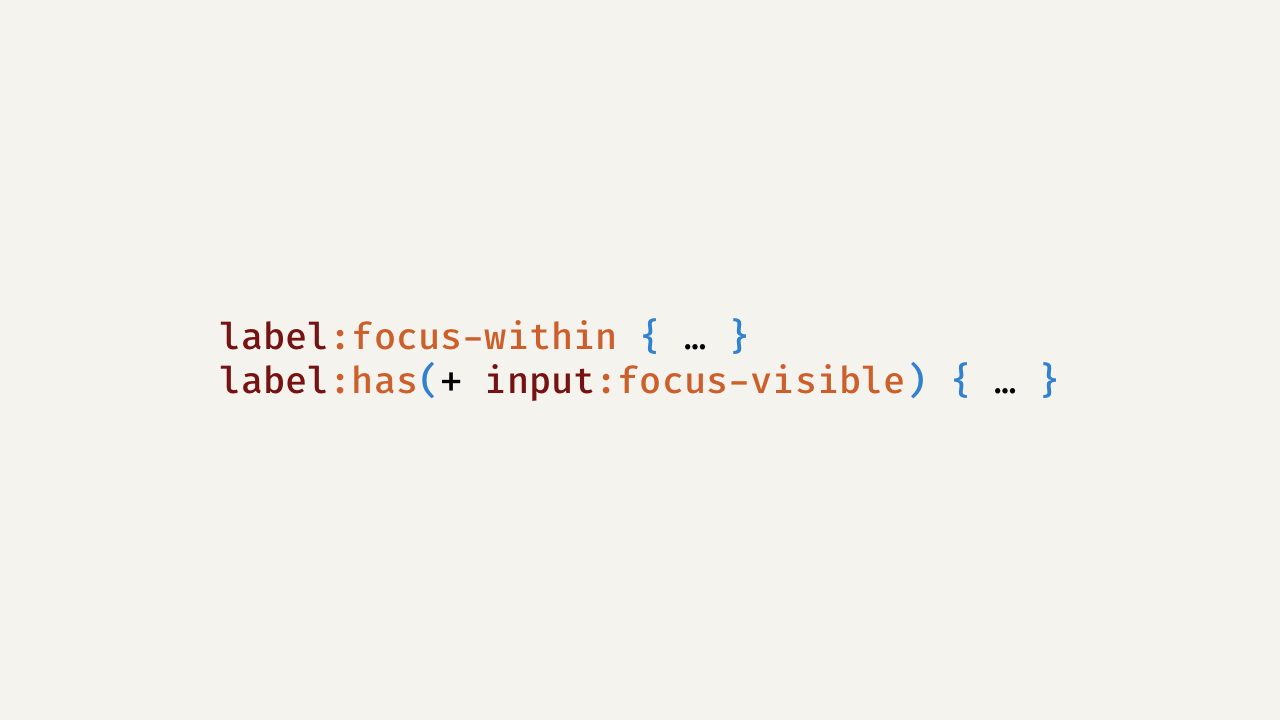
I almost never use label:focus. Labels aren’t focusable by default and putting them in the tab order is bad for keyboard users. What I ship instead:
- Label wraps the input →
label:focus-within { … }(labels react when descendants are focused). See:focus-within. - Label comes before the input →
label:has(+ input:focus-visible) { … }with:has()and:focus-visible. - Input comes before the label →
input:focus-visible + label { … }using the adjacent sibling combinator.
I use :focus-visible instead of :focus to avoid noisy rings on mouse clicks. :has() is mainstream now (Chrome 105+, Safari 15.4+, Firefox 121+) per the MDN compatibility tables on :has().
Why label:focus rarely does what you think
Focus goes to interactive controls (inputs, buttons, links), not labels. You can make almost any element focusable, but adding tabindex to labels creates extra Tab stops and hurts flow. If I need the label to reflect focus, I style it based on the input’s state instead. If you need a refresher on proper association, see the <label> element.
Pattern 1: Label wraps the input (implicit label)
This is my go-to when I control the markup.
<label class="field">
  <span class="field__label">Email</span>
  <input type="email" required>
</label>
/* Highlight the label text when the input inside is focused */
.field:focus-within .field__label {
  color: var(--accent);
}

/* Give keyboard users a clear focus only when it matters */
.field input:focus-visible {
  outline: 2px solid currentColor;
  outline-offset: 2px;
}
label:focus-within lights up when any descendant is focused. See :focus-within.
Pattern 2: Label comes before the input
<label class="field__label" for="search">Search</label>
<input id="search" class="field__input" type="search">
/* If the adjacent input is keyboard-focused, style the preceding label */
.field__label:has(+ .field__input:focus-visible) {
  color: var(--accent);
}
:has() can “look forward” to the next sibling via +. Check :has() and the compatibility table there for exact versions. If you can’t rely on :has(), wrap both nodes and use :focus-within on the wrapper.
Pattern 3: Input comes before the label
<input id="agree" class="checkbox__input" type="checkbox">
<label for="agree" class="checkbox__label">I agree</label>
/* Adjacent (or use ~ for non-adjacent siblings) */
.checkbox__input:focus-visible + .checkbox__label {
  text-decoration: underline;
}
This uses the adjacent sibling combinator. For non-adjacent siblings, there’s the general sibling combinator ~.
Floating labels I actually ship
<label class="float">
  <input required placeholder=" ">
  <span>Email</span>
</label>
.float { position: relative; display: grid; }
.float > input { padding: 1rem .75rem .25rem; }
.float > span {
  position: absolute; left: .75rem; top: .8rem;
  transition: transform .15s ease, font-size .15s ease, opacity .15s;
}

/* On focus or when the field isn’t empty */
.float:focus-within > span,
.float > input:not(:placeholder-shown) + span {
  transform: translateY(-.6rem);
  font-size: .75rem;
  opacity: .75;
}
This relies on :focus-within and :placeholder-shown. No JavaScript.
My accessibility rules
- I use
:focus-visible, not just:focus, so keyboard users get a clear ring without spamming mouse users. This lines up with WCAG’s “Focus Visible”. - I don’t add
tabindex="0"to labels. If I ever need to focus one programmatically for tooling, I usetabindex="-1"and keep the actual Tab order clean. - I always associate labels explicitly (
for+id) or by wrapping the input. Both are valid and assistive-tech friendly per the<label>docs.
Browser support cheat sheet
:focus-within: widely supported.:focus-visible: widely supported and designed for keyboard focus.:has(): Chrome 105+, Safari 15.4+, Firefox 121+.
If you need a feature-query fallback, branch on support with @supports:
/* Modern */
label:has(+ input:focus-visible) { color: var(--accent); }

/* Fallback idea */
@supports not (selector(:has(*))) {
  /* re-order DOM or wrap and use :focus-within */
}
Tailwind CSS versions of these patterns
Tailwind gives you variants for focus-visible, focus-within, peer, group, and arbitrary variants that let you target :has() or @supports. See the Tailwind docs on state variants, focus-visible, focus-within, group, peer, and arbitrary variants. You can also gate features with the supports-[…] variant.
1) Label wraps input → group + group-focus-within
<label class="group block">
  <span class="block group-focus-within:text-accent-600">Email</span>
  <input
    type="email"
    class="mt-1 block w-full
           focus-visible:outline focus-visible:outline-2 focus-visible:outline-current" />
</label>
The group marks the parent; group-focus-within:* styles children when anything inside is focused.
2) Label before input → :has() with an arbitrary variant
<label class="block has-[+input:focus-visible]:text-accent-600" for="search">Search</label>
<input id="search" class="block w-full focus-visible:outline focus-visible:outline-2" type="search">
That has-[+input:focus-visible] compiles down to &:has(+ input:focus-visible).
Optional safety net with a feature query
If you want to scope the :has() styling to supporting browsers using Tailwind:
<label
  class="block
         supports-[selector(:has(*))]:has-[+input:focus-visible]:text-accent-600">
  Search
</label>
<input id="search" class="block w-full focus-visible:outline focus-visible:outline-2" type="search">
The supports-[…] variant emits an @supports(...) wrapper.
3) Input before label → peer + peer-focus-visible
<input id="agree" type="checkbox" class="peer">
<label for="agree" class="peer-focus-visible:underline">I agree</label>
peer marks the input; the label reacts to its state as a subsequent sibling.
Floating label with Tailwind (zero JS)
<label class="relative grid group">
  <input
    required placeholder=" "
    class="pt-4 pb-1 px-3 block w-full
           focus-visible:outline focus-visible:outline-2 focus-visible:outline-current" />
  <span
    class="pointer-events-none absolute left-3 top-3
           transition-transform transition-opacity
           group-focus-within:-translate-y-2 group-focus-within:text-xs group-focus-within:opacity-75
           ">
    Email
  </span>
</label>
This mirrors the plain-CSS version using group-focus-within. If you prefer, you can also drive it with a has-[input:not(:placeholder-shown)] arbitrary variant on the wrapper.
Copy-paste recipes
Label wraps input
label:focus-within .label-text { color: var(--accent); }
Label before input
label:has(+ input:focus-visible) { color: var(--accent); }
Input before label
input:focus-visible + label { color: var(--accent); }
Highlight a whole row on focus
.form-row:focus-within { outline: 2px solid var(--accent); outline-offset: 3px; }
Tailwind equivalents: group-focus-within:*, has-[+input:focus-visible]:*, peer-focus-visible:*, and supports-[…] for feature queries. See state variants.
FAQ
Why doesn’t label:focus work for me?
Labels aren’t focusable by default and the browser sends focus to the associated control. Style the label based on the input’s focus using :focus-within, :has(), or sibling selectors.
Is :has() safe to ship now?
Yes for mainstream targets. Check the MDN table for versions on :has(). If you still support older browsers, add a :focus-within or sibling-selector fallback.
Should I ever add tabindex="0" to a label?
Almost never. It adds a useless stop in the tab order. Keep focus on the control and reflect that state on the label. See tabindex.
Did you like this article? Then, keep learning:
- Explore CSS case sensitivity to complement your CSS knowledge
- Discover how to style HTML dialog backdrops using Tailwind CSS
- Learn to disable hover styles on mobile devices with Tailwind CSS
- Understand modern Tailwind CSS plugins for consistent form styling
- Learn to add and use Tailwind CSS in Laravel projects for UI improvements
- Master best practices in Tailwind CSS to enhance your front-end development
0 comments